
Light Blue Paint Colors for Bedroom: 12 Shades for a Relaxing Space
The best light blue paint colors for bedroom walls range from crisp sky blue and delicate powder blue to muted blue gray and soft blue green. For a bright, airy bedroom, consider Benjamin Moore Breath of Fresh Air 806. If you prefer a more subdued color, look at Sherwin Williams Tradewind SW 6218 or Benjamin Moore Ocean Air 2123-50. For a barely there blue, Benjamin Moore Clear Skies 2054-70 is another option worth sampling.
The right choice depends on how much natural light your bedroom receives, the undertones of your flooring and furniture and whether you prefer a clean blue or one softened with gray or green. Comparing these details before buying paint can help you avoid a color that looks noticeably different once it covers the walls.
TL;DR
- For a fresh, airy bedroom: Start with Benjamin Moore Breath of Fresh Air 806 or Sherwin Williams Sky High SW 6504.
- For a muted, understated look: Compare Sherwin Williams Tradewind SW 6218 with Benjamin Moore Ocean Air 2123-50.
- For a small bedroom: Sample a pale blue such as Benjamin Moore Clear Skies 2054-70, especially if you want the room to feel visually open.
- For warm wood floors and beige bedding: Consider a blue with subtle green or gray undertones rather than an icy, highly saturated blue.
- Before committing: Test two or three colors on large sample boards and view them in morning, afternoon and evening light.
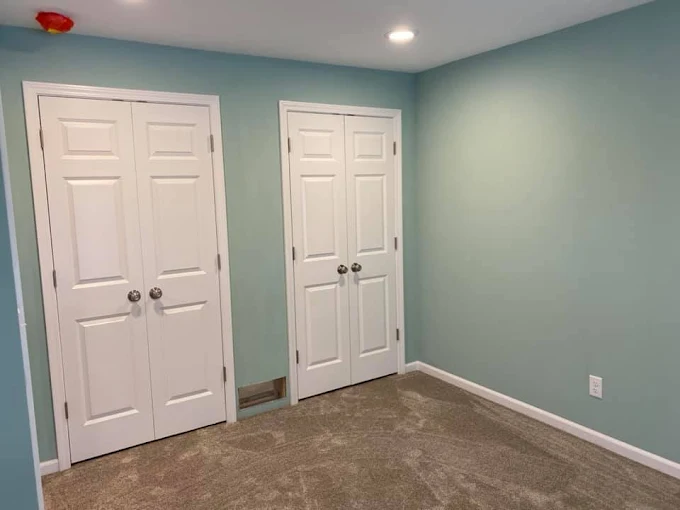
How to Choose Right Light Blue Paint for a Bedroom
Light blue is not one uniform color family. Two shades can look nearly identical on small paint chips but behave differently across four bedroom walls. Understanding their undertones and how your room receives light will help you narrow the options.
Understand the difference between blue undertones
An undertone is the subtle color influence that becomes apparent when you compare a paint shade with other colors or view it under different lighting.
Clear or powder blue
These shades read more directly as blue, with less gray or green influence. They suit bedrooms with white bedding, crisp trim, light colored furniture and a fresh, simple palette. Depending on shade, they can look brighter in strong daylight.
Blue gray
Gray softens the blue and reduces its visual intensity. This category often works well with gray upholstery, natural linen, charcoal accents and contemporary or transitional furniture. In a dim room, however, some blue grays can appear cooler or more subdued than expected.
Blue green
A green influence gives light blue a softer, more aquatic appearance. These colors can complement oak, beige, cream and natural woven textures. Check the sample carefully if you want the walls to remain distinctly blue rather than shifting toward aqua.
Consider the direction your bedroom faces
Window orientation affects quality of daylight entering a room. It is useful starting point, but the size of windows, outdoor obstructions, season and surrounding buildings also matter.
- North facing bedrooms: Often receive cooler, less direct daylight. A very icy blue may feel stark, so compare a slightly muted or blue green option.
- South facing bedrooms: Usually receive more direct sunlight during parts of the day. A pale blue can look brighter and more vivid, so make sure it does not become too saturated for your preference.
- East facing bedrooms: Tend to receive stronger morning light. Compare samples early in the day and again in the afternoon.
- West facing bedrooms: Often have warmer late afternoon light, which can make a cool blue appear less icy or shift the appearance of a blue green.
For homes in Glenview and Chicago’s North Shore, it is particularly useful to evaluate paint under the room’s actual daylight conditions rather than relying on a sample viewed in a paint store. Seasonal changes, mature trees, neighboring buildings and overcast weather can all affect the amount and character of light reaching the walls.
Think about room size and existing finishes
A pale wall color can help a compact bedroom feel more open, particularly when the ceiling and trim are light. However, light blue does not automatically make a room appear larger. Strong contrast, bulky furniture, dark flooring and limited daylight still affect overall impression.
Look at the other fixed elements before choosing paint. Honey oak floors and warm beige carpeting may favor a softer blue green or blue with some gray, while cool gray flooring may work better with a cleaner blue gray.
Account for artificial lighting
A color that looks balanced in daylight may look different beneath bedroom lamps. Warm bulbs can make some blues appear grayer or greener, while cooler bulbs may emphasize a crisp or icy quality.
Check your sample using the lights you normally use in the evening. If you read in bed or use bedside lamps rather than overhead lighting, those lamps should be part of the decision.
12 Light Blue Paint Colors for Bedroom Walls
The following 12 colors come from the official Benjamin Moore and Sherwin Williams color collections. They represent different directions within the light blue family, from nearly white blue to more noticeable blue green and blue gray shades.
Manufacturer color names and digital previews are useful for narrowing choices, not substitutes for physical samples.
Color note: Screen settings and photography can distort paint colors. Compare physical samples before making final decision.
1. Benjamin Moore Breath of Fresh Air 806
Breath of Fresh Air is a good starting point if you want light blue walls that remain visibly blue rather than reading as a tinted white. It has a fresh, clear appearance that suits bedrooms with white bedding, pale wood furniture, and uncomplicated window treatments.
Pair it with soft white trim, natural oak and light gray or cream textiles. The contrast between the walls and white finishes can make the blue more noticeable without requiring a darker accent wall.
Best for: Primary bedrooms and guest rooms where a fresh blue is preferable to a gray based neutral.
Consideration: In a brightly lit room, the color may appear more vivid than it does on a small chip. Test it beside your bedding and trim.
2. Benjamin Moore Ocean Air 2123-50
Ocean Air is worth considering when a straightforward powder blue feels too bright. Its muted character makes it a useful option for bedrooms with natural textures, understated furnishings and a mixture of warm and cool neutrals.
Try it with ivory bedding, pale oak furniture and a warm white ceiling. It can also work with soft gray upholstery if gray does not introduce an unwanted cool cast.
Best for: Bedrooms with linen, wood and other natural looking finishes.
Consideration: Compare it directly with a clearer blue such as Breath of Fresh Air. The distinction between a more subdued blue and a brighter blue becomes especially important in rooms with limited daylight.
3. Benjamin Moore Clear Skies 2054-70
Clear Skies belongs on the shortlist if you want a very light blue that does not dominate the room. Its pale appearance can complement white ceilings, light colored flooring and simple furniture while allowing bedding and artwork to provide stronger visual contrast.
Use it throughout a small bedroom if you prefer a subtle wall color rather than a bold statement. White cotton bedding and light wood furniture can maintain an open, uncluttered appearance.
Best for: Compact bedrooms and rooms where you want the walls to remain light.
Consideration: Very pale paint can lose some of its visible color in strong daylight. Check that the blue is still noticeable enough for your taste.
4. Benjamin Moore Palladian Blue HC-144
Palladian Blue is a blue green choice for homeowners who like a soft, coastal inspired palette but do not want a strong turquoise. Its green influence distinguishes it from clearer, more conventional light blues.
Combine it with creamy whites, natural oak, sandy beige and restrained brass accents. It can suit traditional bedrooms as well as spaces with relaxed, contemporary furnishings.
Best for: Bedrooms with warm wood finishes and natural fabrics.
Consideration: The green component may become more apparent under certain lighting. If you want the walls to look distinctly blue throughout the day, compare this shade with a more neutral blue.
Planning a Painting Project?
5. Benjamin Moore Woodlawn Blue HC-147
Woodlawn Blue is a useful option for a classic bedroom palette. Rather than treating the wall color as a barely visible background, use it to introduce a noticeable but restrained blue alongside traditional furniture, white trim and patterned fabrics.
White bedding, medium tone wood and muted navy accents can give the room definition without creating high contrast scheme.
Best for: Traditional bedrooms, guest rooms and spaces with classic furniture.
Consideration: If your room has several cool gray finishes, test the combination together. You may prefer a blue with less green influence for a more consistent cool toned palette.
6. Benjamin Moore Glass Slipper 1632
Glass Slipper is worth sampling if you prefer a delicate, understated blue that can sit comfortably alongside light neutrals. It is a useful comparison color for homeowners who find stronger powder blues too colorful for the bedroom.
Consider pairing it with soft white trim, gray beige bedding and light wood furniture. The result can feel coordinated without requiring every finish in the room to share the same undertone.
Best for: Minimalist bedrooms and spaces where wall color should remain subtle.
Consideration: Pale, muted shades can appear almost neutral in some lighting. Sample it beside a slightly stronger blue to determine how much color you want.
7. Benjamin Moore Jet Stream 814
Jet Stream is another option for homeowners comparing clear light blues. It works as a starting point for a bedroom palette with white finishes and a restrained mix of cool and neutral colors.
Consider pairing it with white trim, pale gray bedding and natural wood nightstands. Navy pillows or artwork can add contrast without making the walls feel secondary.
Best for: Bedrooms where you want a recognizable blue with a clean, simple palette.
Consideration: Check it against your trim before deciding on a white. A very cool white may emphasize the blue’s coolness, while a creamier white can create a softer contrast.
8. Benjamin Moore Ocean Air’s lighter alternative: Benjamin Moore Clear Skies 2054-70
Rather than repeating the same shade, a more useful comparison is Benjamin Moore Morning Sky Blue 2053-70.
Morning Sky Blue offers another pale blue direction for bedrooms that need a lighter visual treatment. Compare it with Clear Skies if you are trying to determine whether you prefer a hint of color or a more noticeable blue on the walls.
White trim and ceiling finishes, pale gray bedding and light oak furniture make a straightforward starting palette.
Best for: Bright, simple bedrooms and guest rooms.
Consideration: Because this is a very light color, it may not provide enough contrast if your furniture, bedding, and flooring are also very pale.
9. Benjamin Moore Crystal Blue 2051-70
Crystal Blue is a useful candidate for a bedroom where you want a recognizable light blue rather than a color that nearly disappears into the white trim. Its place in Benjamin Moore’s light blue collection makes it worth comparing with other pale blue options before settling on a sample.
Try it with white bedding, warm wood furniture, and a few deeper blue accents. This creates a simple palette in which the walls supply most of the color.
Best for: Bedrooms that need a little more visible color than an almost white blue.
Consideration: Check how the shade reads under both natural and artificial light. A blue that looks balanced during the day may feel more pronounced at night.
10. Sherwin Williams Sky High SW 6504
Sky High is worth considering if you are drawn to the familiar look of a light sky blue. It provides an alternative to muted blue gray colors when you want the walls to read more clearly as blue.
Pair it with white trim, light wood furniture and neutral bedding. If you prefer a layered blue palette, deeper navy accents in pillows or artwork can add definition.
Best for: Bright bedrooms and spaces with white or natural wood finishes.
Consideration: A clearer blue can look more vivid in direct sunlight. Sample it over a large area before choosing it for all four walls.
11. Sherwin Williams Tradewind SW 6218
Tradewind is one of the strongest candidates if you want blue that is softened by both gray and green. Sherwin Williams describes it as a light blue with green undertones and a calming gray influence.
This combination makes it worth comparing with clearer sky blues. Use it with soft white trim, warm oak, cream textiles and muted gray accents. It can also work with beige carpeting when the beige is not strongly yellow.
Best for: Bedrooms with natural wood, linen and a relaxed neutral palette.
Consideration: If your goal is a distinctly blue wall, make sure the green influence does not become too prominent under your room’s lighting.
12. Sherwin Williams Topsail SW 6217
Topsail is a useful option for homeowners who want a light, coastal leaning blue with a softer appearance than a straightforward powder blue. Sherwin Williams lists it as a coordinating color for Tradewind, making the two worth comparing if you are exploring blue green shades.
Pair it with warm white, natural wood and cream or sand colored bedding. If you like a restrained coastal palette, introduce deeper blue through artwork or a small number of accessories rather than adding several competing colors.
Best for: Bedrooms with warm neutral finishes and a subtle coastal influence.
Consideration: Blue green shades can shift toward aqua depending on lighting and surrounding finishes. Test it next to your floor and bedding to make sure the overall palette remains balanced.
Planning a Painting Project?
Which Light Blue Paint Works Best for Different Bedrooms?
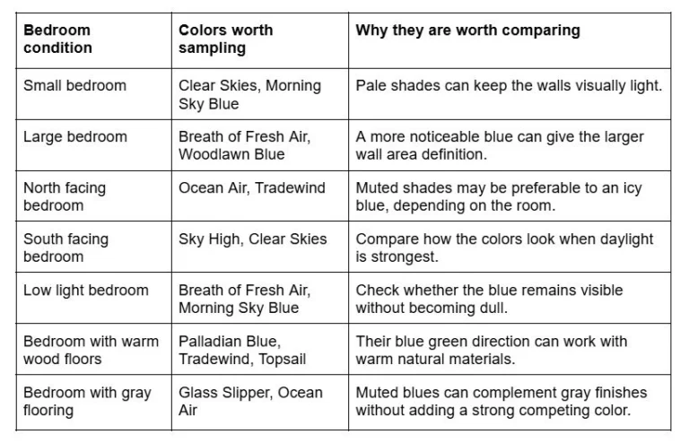
A north facing room with large windows may have more usable daylight than a south facing room shaded by mature trees. Test the finalists on the walls or on movable sample boards before making the decision.
What Colors Go With Light Blue Bedroom Walls?
The best accompanying colors depend on whether you want the blue to feel crisp, warm, understated or more dramatic.
White trim and ceilings
White is a straightforward partner for light blue, but the particular white matters. A clean white can make the blue look sharper, while a softer white can create a gentler transition between the walls and trim.
If you are considering Benjamin Moore Breath of Fresh Air, compare it with the white already used on your doors and window casings before choosing a new trim color. Keeping existing trim can simplify the project and prevent an unnecessary difference between adjacent finishes.
Beige, cream and warm neutrals
Warm neutrals are especially useful when bedroom contains wood furniture, beige carpeting or natural linen. They help balance a cool wall color without competing with it.
Cream bedding, a sand colored upholstered headboard and a natural wood nightstand can work well with a muted blue green. If your beige has a pronounced yellow or orange cast, test the combination carefully because it may make a cooler blue appear more intense by comparison.
Gray and charcoal
Gray is a practical pairing for blue gray paint and modern furnishings. Light gray bedding keeps the room restrained, while charcoal cushions or artwork create stronger contrast.
The main consideration is temperature. Cool blue, cool gray and bright white together can produce a distinctly cool palette. If that feels too stark, introduce a warmer wood tone or cream textile.
Natural wood and muted green
Oak, maple, walnut and other wood finishes bring visible warmth and texture to a blue bedroom. The exact effect depends on the wood’s undertone and finish, so compare your sample with the actual furniture or flooring.
Muted green can also complement light blue, particularly when the blue itself has a green influence. Keep one shade more prominent and use the other in smaller accents to avoid a room full of competing cool colors.
Navy, terracotta and restrained accent colors
For a little more definition, add navy through a throw, pillow or piece of artwork. Terracotta and muted rust can provide a warmer counterpoint to a pale blue wall. Brass colored hardware or a lamp can introduce another warm note.
You do not need all these accents. Two or three supporting colors are often enough to make the room feel coordinated.
Planning a Painting Project?
Best Paint Finish for Bedroom Walls, Trim and Ceilings
Paint color gets most of the attention, but sheen influences the final appearance too. The right finish depends on the paint product, wall condition, cleaning expectations and how much light reflects across the surface.
- Flat or matte: Offers minimal sheen and can reduce the visibility of small surface irregularities. It may be less washable than some higher sheen products, although performance varies by formulation.
- Eggshell: Has a subtle sheen and is common option for bedroom walls. It can provide a practical balance between a low sheen appearance and routine cleanability.
- Satin: Reflects more light and is often considered for surfaces that need more frequent cleaning. It can make patches, dents and uneven wall texture more noticeable.
- Semi gloss: Often used for trim, doors and other surfaces where a harder, more washable finish is desirable.
- Ceiling flat: Commonly used on ceilings to minimize glare and reduce visible reflections from surface imperfections.
A matte or eggshell wall finish is a reasonable starting point for many bedrooms. If the walls have noticeable repairs, ask your painter to assess the surface before choosing a higher sheen.
Also, follow the manufacturer’s recommendations for the specific paint line. Finish names alone do not establish identical durability or washability across different products.
How to Test Light Blue Paint Before Committing
Sampling is one of the most useful steps in choosing light blue bedroom paint. It allows you to compare colors under the conditions that actually matter, rather than relying on a printed chip or digital image.
- Narrow your list to two or three colors. Choose shades that differ meaningfully, such as a clear blue, a blue gray and a blue green. Testing near identical shades can make comparison harder.
- Use large samples. Apply samples to boards or suitable sample surfaces large enough to show the color clearly. Follow the paint manufacturer’s directions for the sampling product.
- Place samples near different parts of the room. Check one near a window and another on a wall farther from the natural light source. Avoid judging the entire room from a single bright spot.
- View the samples at different times. Compare morning, afternoon and evening appearances. In Glenview and the North Shore, cloudy days and seasonal daylight changes can affect what you see through the windows.
- Turn on your usual bedroom lighting. Check the colors beneath your bedside lamps and overhead fixture. If you use warm bulbs at night, test the paint with those bulbs rather than a different light source.
- Compare the samples with the room’s finishes. Look at the flooring, trim, headboard, bedding, curtains and any large upholstered furniture. These surfaces can make the undertones easier to identify.
- Check the surface and finish, not just the color. A sample painted on a smooth board may not look exactly like a finished wall with a different texture or sheen.
A small paint chip can be misleading because you see it against the store’s lighting and surrounding display colors. A larger sample reveals more of the shade and makes it easier to judge how it relates to the rest of the room.
Once you have a clear favorite, check the exact color name, code, product line and finish before purchasing the full quantity.
Should You Hire a Professional to Paint Your Bedroom?
Painting a bedroom yourself may be manageable if the walls are in good condition, the color change is modest and you have the time to prepare the room carefully. Professional painting becomes more useful when the job involves substantial repairs, uneven surfaces, extensive patching or a major change from a dark wall color to a pale blue.
Surface preparation matters because light paint does not hide every defect. Dents, old repair marks, rough patches and differences in surface texture can remain visible after painting, particularly when daylight travels across the wall at an angle.
A professional painter can help assess the wall condition, determine what preparation is needed, recommend a suitable primer when necessary and apply the chosen finish consistently. If you are changing from a deep navy or saturated color to pale blue, ask how the existing finish and color may affect preparation and coverage.
For homeowners comparing professional options, Big League Painting provides residential painting services in Glenview and Chicago’s North Shore. You can discuss your bedroom’s surface condition, color choices and preparation requirements when requesting an estimate.
Conclusion
The best light blue paint colors for bedroom walls are the ones that work with your room’s lighting, existing finishes and preferred level of color. Breath of Fresh Air offers a useful starting point for a clear blue, Ocean Air is worth comparing for a more subdued look and Tradewind or Palladian Blue may appeal to homeowners who prefer a blue green influence.
Before buying paint, shortlist two or three colors and view large samples beside your flooring, trim and bedding throughout the day.